Project
The Petfinder Foundation is a national organization that gives cash and product grants to adoption groups. Their grants support pets awaiting adoption—by putting food in bowls, providing medical care, and rescuing animals from disasters. They do amazing and heartwarming work.
I had initially teamed up with the Petfinder Foundation on a smaller project—a reworking of a program-specific donation page—that had resulted in 15x as many donations. And I was delighted when the team came back the next year interested in a redesign of their site, petfinderfoundation.org. Their content had outgrown the site structure, and they were looking to make improvements that would increase donations. The site also needed to be maintainable and customizable for a small team.
For this site, I worked with three awesome collaborators: Alex Ording (development), Lisa Kaneff (content writing), and Emily Patterson (analytics). I served as project lead and UX/UI designer.
Discovery
We talked extensively with the Petfinder Foundation team about their site needs and goals, and we conducted audits of their existing content and analytics. We also reviewed research from previous interviews I had conducted about their donation process.
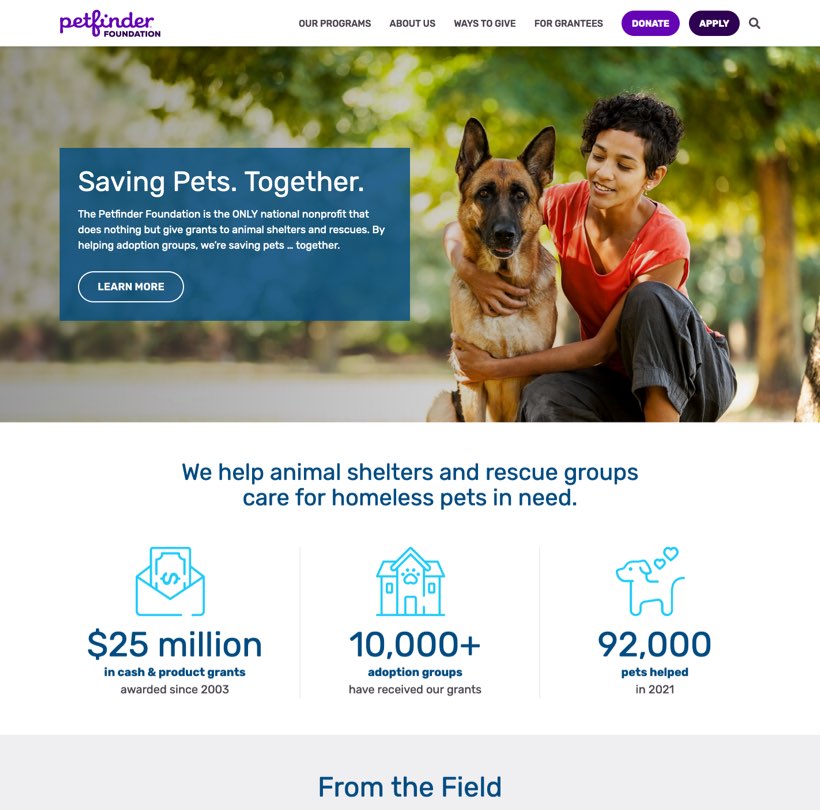
We learned one of their biggest challenges is brand recognition among potential donors. They often confuse the foundation with its well-known counterpart, Petfinder.com, a searchable database of adoptable pets. A high percentage of users were leaving the site after landing on the homepage, and many interviewees (even regular donors) expressed confusion about the difference between the sites.
Also of note, we heard repeatedly that donors care deeply about how their money is spent and appreciate financial transparency. Petfinder Foundation does an amazing job using donations efficiently—at least 90% of every dollar goes directly towards helping pets. They also have a 4/4 star rating on Charity Navigator.
Key takeaway: The foundation is doing wonderful work that donors care about, but some of their key messaging was getting lost on the site. The redesigned site should focus on better communicating who they are and what they do to potential donors.
To increase donations to the Petfinder Foundation, through a) better telling the Foundation’s story to potential donors and b) making the online donation process easier to use.
Discovery
We identified 2 main audience groups:
Pet adoption groups—Petfinder Foundation offers a number of cash and product grants to these groups. They cater to adoption groups of all sizes—from brick-and-mortar shelters with large staffs to small volunteer-based teams with no grant-writing expertise.
Donors—These could be individual donors or corporate partners. Many of their donors are focused on helping pets, while others seek them out specifically because of their low admin costs. A goal of the new site is to provide more content for this audience.
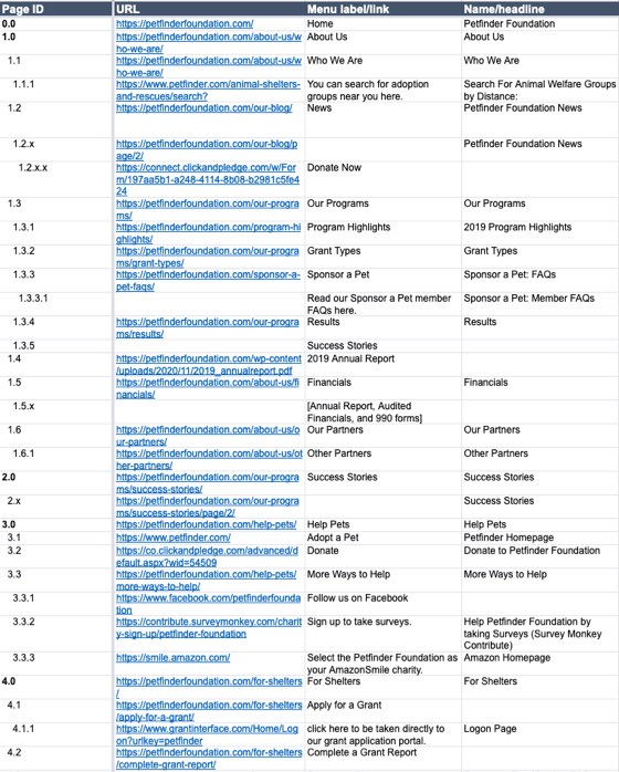
Information architecture
With our goal of better telling the foundation’s story to donors, we rethought the overall site structure. Some notable updates:
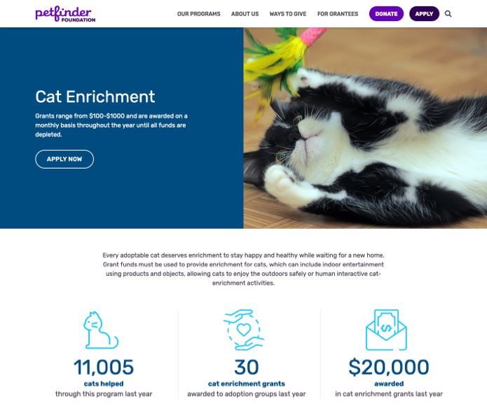
Elevate programs—On the old site, information about the different grants was buried in the navigation. We made “Programs” a top-level item in the navigation and added information about each grant, to elevate this key content.
Reduce audience-specific content—Much of the grant content on the old site was written for specific audiences. Over time, this had become unwieldy, and resulted in duplicate pages with similar content. Where possible, we worked to refocus content around topic.
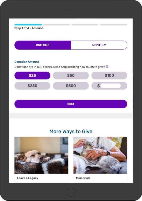
Streamline donations—The old site had many donation options in the navigation, and the differences between them weren’t always clear. We simplified this first interaction, so 1 button leads to a multi-step donation form. And we added better analytics tracking, so we can continue to refine over time.
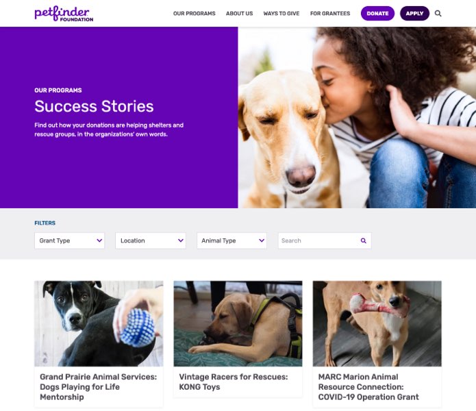
More structure for success stories—Success stories feature updates from grant recipients on how their cash or product was used. They’re a heartwarming part of the site, and we wanted to make them easier to navigate. With this in mind, we rethought the tagging system for these posts and added filtering capabilities, to help visitors better find stories based on shelter, grant type, pet type, etc.

Johanna and Alex were fantastic to work with. From planning to the actual development of our new website, they were there to help guide us each step of the way. The end product is far better than I ever imagined it would be, and they both made an intimidating process as smooth and easy as possible.
—Toni Morgan, Executive Director of the Petfinder Foundation
Design
We created a set of components for the site focused on maintainability and customizability. The team is small, and some of their most urgent work is in response to disasters (like hurricanes and wildfires) that leave pets in peril. So they need the ability to add different types of content fast.
The site is built in WordPress with Gutenberg blocks. Custom blocks include:
These components can be used throughout the site, giving the team flexibility in telling their story.
Usability testing
After building a prototype, I conducted 2 types of usability testing:
For both groups, the main goals were to identify any issues with the new navigation and donation flow, and to identify any additional content these groups would find useful. Some main insights:
Next steps
Now that the new site has launched with more advanced analytics, the team can regularly review how the site is performing. Some questions to consider:
This data will help guide where to refine design elements, update content, and add new functionality in the future.
AAA Foundation for Traffic Safety
Primary Care Progress