Project
The National Council of Architectural Registration Boards (NCARB) is a nonprofit that helps US-based architects attain and maintain professional licensure. In order to practice architecture in a US state, you must be licensed by that state. Getting this license is a rigorous process involving the 3 Es—education, experience, and exams. NCARB facilitates this process, upholds standards of safety, and offers certification that makes it easier to get licensed in multiple states.
NCARB has a dashboard, called MyNCARB, that helps architects and architectural candidates track their career progress. There’s different experiences for different career levels. For candidates, the tool helps them track the 3 Es needed for licensure.
NCARB wanted to add new functionality to their dashboard, so candidates could sign up for an exam directly in the tool. While they were making this upgrade, the team also wanted to refresh the dashboard to make UX improvements and better align with NCARB’s new branding. And they wanted to establish a more robust UX practice within the product team.
I worked with NCARB for 2 years and ended up redesigning multiple sections of the dashboard. Here I’d like to focus on the Exams section.
UX researcher and designer
I teamed up with EightShapes, particularly the incomparable Dan Brown. Dan was consulting with NCARB on multiple UX projects at the time. He managed high-level UX strategy for MyNCARB, while I handled much of the day-to-day design work.
Discovery
We focused on 2 main audiences that use MyNCARB regularly:
Dan and I spent a lot of time learning from both groups.
To redesign NCARB’s dashboard for tracking professional licensure, and help the product team build their in-house UX practice.
Discovery
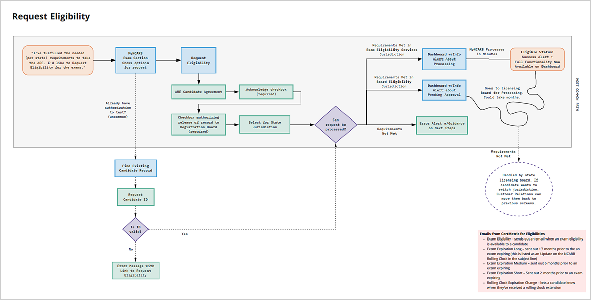
One of our first steps was to learn from the NCARB team about their many processes. Tracking each of the 3 Es takes a lot of coordination between the aspiring architect, NCARB product owners, customer support, and external experts (like the transcript office at your school or your boss signing off on work reports). And the team had rigorous steps to make all that happen. Dan and I held working sessions with various teams to better understand existing processes, document pain points, and map out potential new processes.
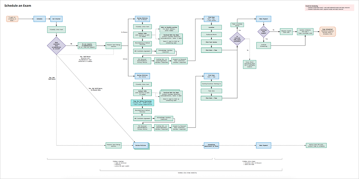
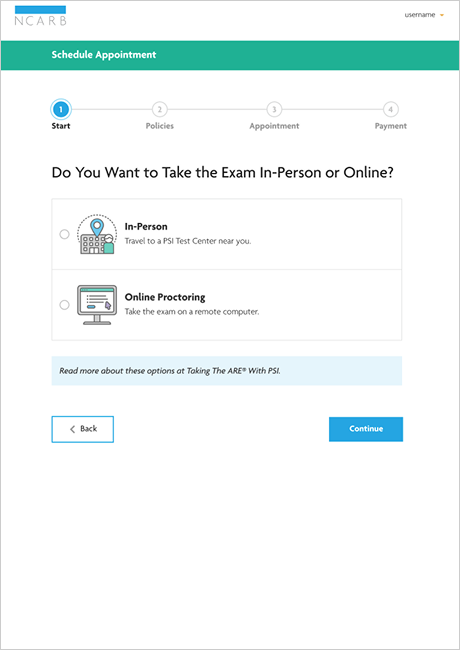
For exams, we learned a lot about the logistics of taking the 6 parts of the Architect Registration Examination (ARE), including how scheduling had worked in the past. We also studied the capabilities of their exam vendor’s API, to understand opportunities and constraints for hosting the scheduling functionality directly on MyNCARB. We then created detailed userflows for the new exam functionality, which proved especially useful for refinement conversations with NCARB product owners and engineers.
Something I found particularly interesting was that NCARB has worked hard over the years to make a career in architecture more accessible for more people. This includes offering paths for people with less traditional backgrounds (like someone with experience but no formal architecture education or an international candidate who got licensed under a different country’s rules). For exams, this includes offering in-person and online options as well as accommodations for people during the test. These alternate paths certainly made our userflows more complicated, but they spoke volumes about NCARB’s commitment to balancing rigorous standards with career support.
Design operations
Since the team was looking to revamp the dashboard, we decided to build a design system as a foundation for our work. I led this effort on the design end, primarily:
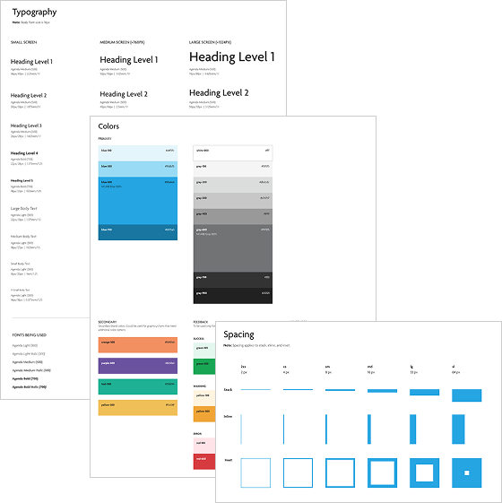
The marketing team had recently rebranded and launched an updated NCARB site. I adapted these styles for the dashboard. My goal was to identify a limited range of type styles, colors, and spacing amounts to be used throughout, to give the tool a more consistent look and feel and provide direction for design work moving forward. I also took special care to identify and document text/background color pairings that adhered to the WCAG AA color contrast standard.
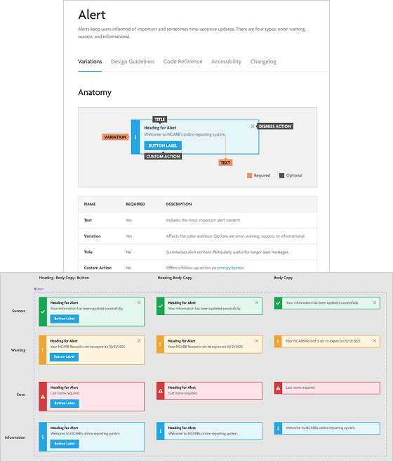
I built around 30 components in Sketch/Figma for our design system, including alerts, buttons, and form fields. These components were designed for flexibility. I made them responsive, so they’d work well at different screen sizes, and set them up to be resilient for varying amounts of text, icons, etc.
Also of note, the design system wasn’t something I set up once and then forgot about. It was a tool to be actively used by the design team, so I was regularly seeking feedback and looking for ways to improve it. For example, my initial table component proved too cumbersome and rigid for the variety of tables the team needed to create. So I ended up breaking this component into row types that could be combined more freely.
I also collaborated regularly with NCARB’s engineering team to make sure the components in our design tool matched the coded components being built in Storybook. This was a big lift, and I was fortunate to partner with some stellar engineers. They brought lots of strategic know-how, and were always ready to kick the tires on early design iterations to make them better and more resilient.
This collaboration was also critical for establishing shared vocabulary that design and engineering could use to communicate. We aligned our names for styles, components, and patterns, so that we’d all be referencing items in the same way. For example, primary button, medium size is a lot clearer than blue button, and makes it much easier to maintain consistency as different people are building different parts of the tool. The team used the Tailwind CSS framework, so we also identified where it would be easier to align with framework terms.
In order to help the team better understand the design system, I drafted detailed documentation for Storybook. I included explanations of what components were meant for, examples of how they were used, and guidelines to keep in mind. For example: 3 form fields that get used a lot in MyNCARB are radio buttons, selects, and combo boxes. They all have a similar purpose—they allow the user to select 1 item from a list. I included guidelines on how the number of items in the list usually dictates which of these components to use.
Design
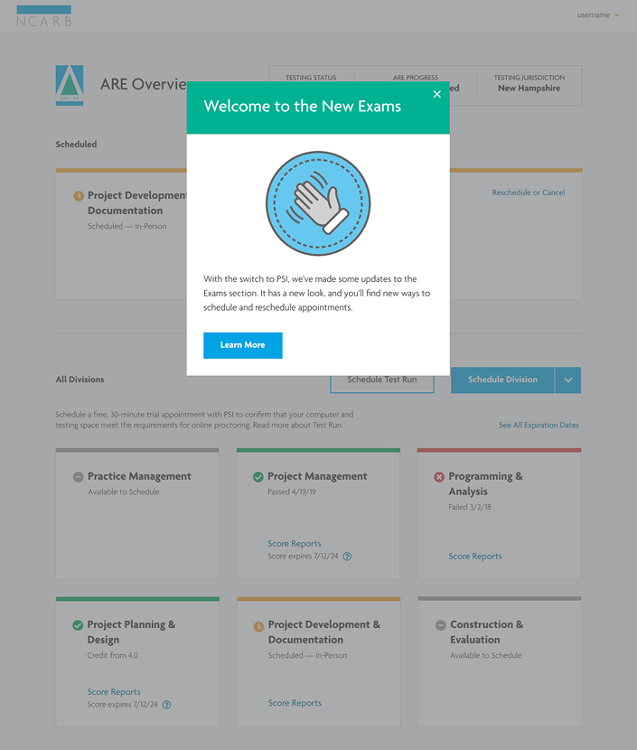
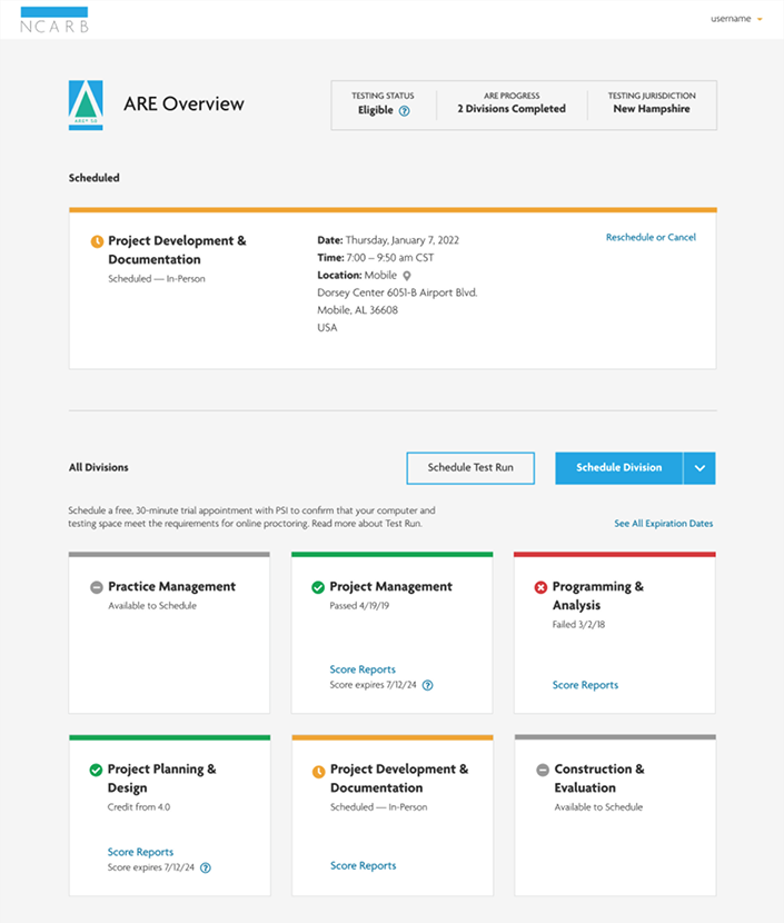
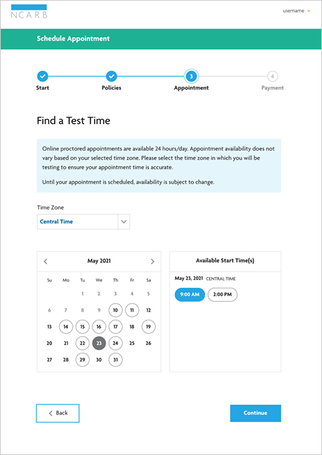
I then got to work designing the new Exams section using the styles and components from our design system. I built screens for:
Once again, I worked closely with the engineering team to make sure the designs were feasible. We made a number of tweaks as we went along to align with the data available from the exam vendor API.
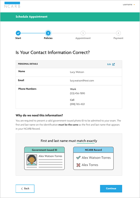
The rules for taking an exam are strict—they want to avoid any opportunity for cheating. In a few instances, I included guidance in the scheduling flow to help prepare candidates for these rules. For example, candidates will get turned away from testing sites if the first and last name on their government-issued ID doesn’t exactly match the name on their NCARB record. We heard this is a common problem for candidates who have long names or recently had a name change. So I included a screen in the scheduling flow that provides context for this issue and allows the candidate to make edits to their record before proceeding.
Johanna is not just a versatile designer who can take on a wide variety of challenges, she's also delightful to work with—a reliable client manager, a thoughtful creative partner, and a tireless advocate for the user.
—Dan Brown, project lead and information architect extraordinaire
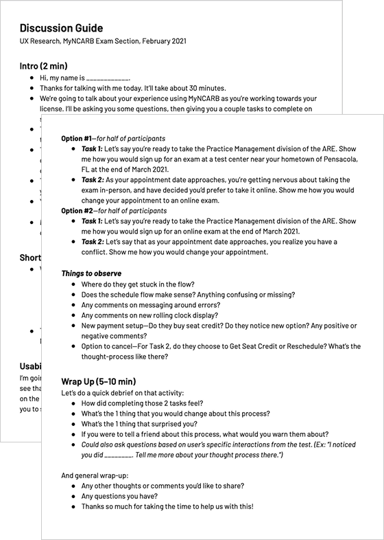
Usability testing
Dan and I conducted regular research with architectural candidates, to better understand their pain points with MyNCARB and test out the new designs. We also included members of the NCARB product team in these sessions, first as observers and later as facilitators, to help them build up their in-house capacity to conduct research.
I drafted research plans and discussion guides, built prototypes, facilitated about half of the sessions, helped synthesize our findings, and then used insights to keep iterating.
We learned a lot about where candidates get confused with exam logistics and could use extra support. And we got helpful feedback on the designs. For example, in some early testing, we heard candidates were frustrated that they had to go through a number of screens before they could see the available dates and times for an exam. (This order is important, because the system needs to verify information before candidates can schedule.) So we tested a version where the user could pull up the schedule right at the beginning, but couldn’t book anything until later. This functionality ended up being more confusing than helpful, so we scrapped it. What we found was that participants consistently expected they could book their date/time from this view. And got grumpy when they couldn’t. This was a great thing to test out quickly with a little prototype, before we sunk engineering time into building it.
Collaboration
One of my favorite parts of this project was fostering cross-functional collaboration with the larger NCARB team. I spent a lot of time reaching out to various experts at NCARB—especially product owners and customer support representatives—to better understand the architecture ecosystem. And what I learned was these colleagues had a wealth of knowledge not just about NCARB processes, but also about user behavior and pain points on the dashboard.
I was excited to bring more of these experts into the design conversation. So I formed a bi-weekly braintrust working session and widely invited folks from customer support and product workstreams. The goal was for us to regularly review my in-progress designs as a team. These sessions were incredibly beneficial. They increased collaboration, provided invaluable stakeholder insight, and built buy-in for the changes we were introducing to the tool. And the work got better and better, because more perspectives were weighing in on key decisions. I was very proud of this multi-department collaboration, and so appreciative for the team’s generosity with their time and expertise.
A fond farewell
By the end of my 2 years working with NCARB, the product team had gotten enough momentum to hire 2 full-time UX designers. It was a bittersweet moment for me as I rolled off the project. I left very proud of the practices I helped establish, and so pleased the NCARB product team was ready to invest in their in-house UX expertise.
IRS Direct File | Year 2
Petfinder Foundation